
Clear before clever
Readers should understand the decision, action and evidence without decoding the design.
Version 2.0 · October 2026
One system for clear decisions: restrained colour, generous space, real people and product evidence.
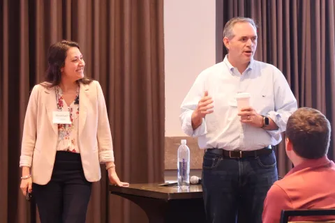
Readers should understand the decision, action and evidence without decoding the design.
The Cipher diagram, numbered steps and comparison rows make the method visible.
Gold marks actions and emphasis. It does not become background noise.
Use real people, real product screens and named evidence—never anonymous visual filler.
A 1200 px container, 12-column desktop grid, 8 px spacing rhythm and an 18 px body base.
Headings, dark bands and primary structure.
Primary actions, focus and connective emphasis.
Callouts and the HireBest side of a comparison.
#ffbd26 is the interface accent for buttons, focus and emphasis. #996a00 is the accessible gold for text on light backgrounds.
The logo artwork contains #ffbd72. Leave the logo file unchanged, but do not introduce that pale gold as a new interface colour.
Display headings use the HireBest heading face at tight leading. Body copy stays readable at 18/30 on desktop and 17/28 in long articles. Do not justify text.
Define. Interview. Decide.
Use one primary action per decision point. Secondary actions carry an outline.
Buttons use dark text on gold, meet a 48 px minimum touch target at full size, and retain a visible keyboard focus. The phone header uses the same five navigation links as desktop plus Request a demo.
Why the role exists.
What changes in year one.
What the person produces.
How the work gets done.
Retain approved photographs of real people on main marketing pages. Do not replace them with abstract graphics, avatars, stock-like AI people or generated portraits.


“If you want to get serious about hiring, then you need your team trained by HireBest.”
Visually inspect assets. The old book page labelled three company marks with people's names; the rebuilt page correctly describes them as the HST Pathways, Randys Worldwide and Facilities Group logos. Craig's adjacent photograph is the actual portrait.
Screenshots sit inside a framed surface. The zoom affordance appears on hover and touch devices, and the CSS-only lightbox needs no JavaScript.
Always measure the source asset and include intrinsic width and height.
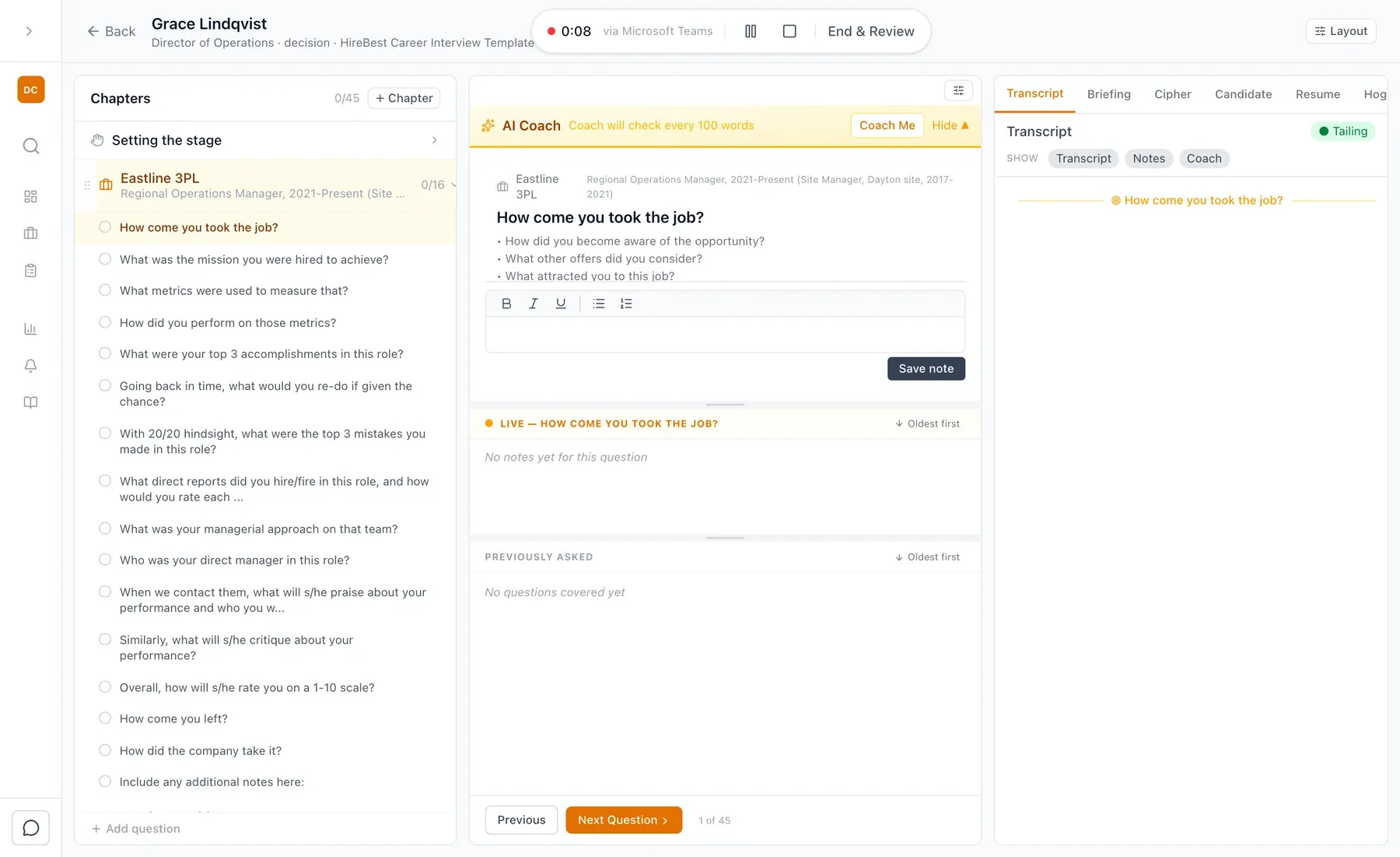 (opens a larger view)
These are the shared patterns in assets/hb-system.css.
.hb-card, .hb-grid--2/3/4 for grouped choices and capabilities.
.hb-split pairs explanation with a photo, quote, screenshot or callout.
.hb-stats and .hb-stat, always followed by a visible source or caveat.
.hb-faq uses native details/summary and matching FAQPage JSON-LD where appropriate.
.hb-phones and .hb-phone present measured app screens without pretending they are human photography.
.hb-compare stacks on phones and uses a warm surface only for the HireBest column.
.hb-post-* constrains long-form reading; archive cards retain measured images or use the branded placeholder.
.hb-cta-band closes the argument with one primary and at most one secondary route.
.hb-footer keeps the same grouped information architecture on every page.
Example only. Every published number needs a named source, defined population, period and methodology—or an explicit internal-data caveat.
Product films use this design system, so a film looks like part of the page it sits on. Series 1 films answer one buyer concern in 60 to 90 seconds, in the four beats below. Series 2 films walk through one part of the product, framed by the HireBest method, in 90 seconds to 2 minutes, with one narrator.
The buyer's worry, in the buyer's words. 5 to 10 seconds.
One unbroken take of the real product. 40 to 60 seconds.
One product fact the film has just shown. No customer names, quotes or numbers. 5 to 10 seconds.
Book a demo. No form. 5 seconds.
Full-frame ink #364959. The concern in large white heading type, with one key word underlined in accent #ffbd26. It must read with the sound off.
Lower right. White cards with a 16 px radius and a soft shadow. Ink body text. Never over the area the camera zooms into.
Accent #ffbd26 rings on each element the voice names. Eased push-ins on the part being explained.
Surface #f6f8fa with ink text. The fact must also appear on the page that carries the film, or on the security page.
Ink background, a gold “Book a demo” button shape and the HireBest logo.
Every film, in both series and every format (16:9 and the 4:5 LinkedIn cut): burned in, white on an ink bar, bottom centre and clear of the straps, word for word with the voice track. Ship a caption file as well. Most viewers watch with the sound off.
One template at 1280 × 720: the concern line, six words or fewer, on ink; a cropped product screenshot at the right; the logo. The same image is the poster on this site and the YouTube thumbnail. Films play from this site first; YouTube is second, for discovery.
noindex, follow until cutover.New pages should feel recognisably HireBest without inventing a new visual language each time.